HubSpot theme documentation
Answerable
A HubSpot CMS theme for a site that wants to be read by people and by the machines that answer for them. Six section modules publish what they are, as structured data, in the HTML a crawler receives. Motion is a layer on top, in three levels, with a switch for the visitor.
- What the theme is
- Getting started
- The page, top to bottom
- Theme settings
- The modules
- The rules every module shares
- Motion
- Structured data
- Building a page
- Questions
1. What the theme is
Answerable's home page is one argument in the order a careful reader wants it: the page's
question and its answer first, then the evidence, the method, when it fits and when it does not, the
questions a reader still has, and where to go next. A machine reading the page gets the same order as
typed data: the hero's short answer as a Question, the evidence cards as
Claims with a citation each, the method as a HowTo, the comparison as
Product rows, the questions as an FAQPage. The layout adds the site graph:
who publishes the page, what the page is, when it changed, how to search the site.
Everything a reader needs is in the page before any script runs. There is no dependency, no web font and no third party request. Measured on HubSpot's own hosting it scores desktop 94 / 100 / 98 and mobile 95 / 98 / 97 for accessibility, best practices and performance, and it passes HubSpot's marketplace validator with no failures.
2. Getting started
- Install the theme from the HubSpot Marketplace. It appears under Settings, Website, Themes and Modules, and in the theme picker when you create a page.
- Set the organisation. Settings, Account Defaults: company name, street, city, postal code and country. The site graph publishes the address only when street, city and country are all filled in, so a half-filled address is published as no address at all.
- Open the theme settings (Edit theme) and set the brand colours, fonts and the two menu ids: the header menu and the footer menu, from Settings, Website, Navigation menus.
- Create a page from the Home template. It comes with all six modules in order; replace the sample content, module by module, starting with the hero's question and answer.
- Check it as a crawler would. View the published page's source: six
application/ld+jsonblocks, oneh1, and every answer visible without a script.
3. The page, top to bottom
| Module | For the reader | For the machine |
|---|---|---|
| Answer brief | Asks the page's question and answers it in two sentences, before anything else | Question with its accepted Answer |
| Evidence cards | Three claims that hold the answer up, each with where it comes from | ItemList of Claim, each with a citation |
| Method explorer | How it is done, in three steps, with what you start and leave with | HowTo with a HowToStep each |
| Fit comparison | When it is the right choice and when it is not, as a real table | ItemList of two Products with typed rows |
| Expert answers | The questions a reader still has, each answered and sourced | FAQPage |
| Next step | Where to go now, by the reader's situation | nothing, on purpose: a call to action is interface, not content |
The small badges beside each eyebrow on the live examples ({ } Question,
{ } Claim ×3, { } HowTo) name the type each block publishes. They are a
switch on each module, Show the schema badge, and off by default.
4. Theme settings
Set once, inherited by every page, under Edit theme.
| Group | What it holds |
|---|---|
| Brand | Logo and its width, primary and secondary colour (the accent and the ink). |
| Typography | Body and heading fonts, h2 to h6 fonts, link colour, hover, underline. |
| Colours | Page, surface, text, muted text, border, focus ring. |
| Buttons | Text, background, border, their hover states, corner radius. |
| Forms | Background, border, label, field border, button and its hover. |
| Header | Colours, font, a separate logo, and the id of the HubSpot menu to render. |
| Footer | The same, for the footer. |
| Layout | Content width, corner radius, density. |
| Answer engines | Organisation type for the site graph, a search action and where it points, the speakable specification. |
5. The modules
Every section module has the same skeleton, so its fields are grouped the same way in the editor: Content (what it says), the module's own groups, Answer engines (what it publishes), Style (how it looks).
5.1 Answer brief
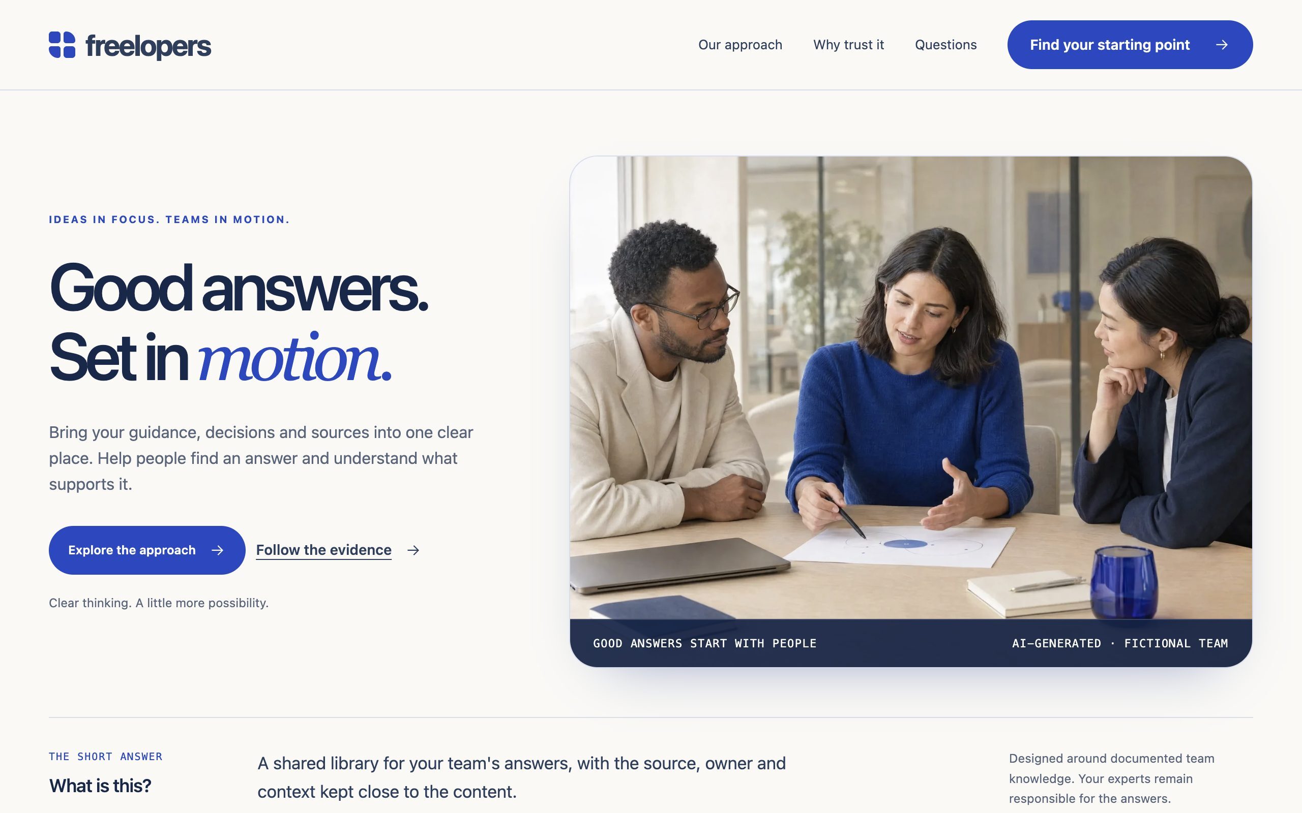
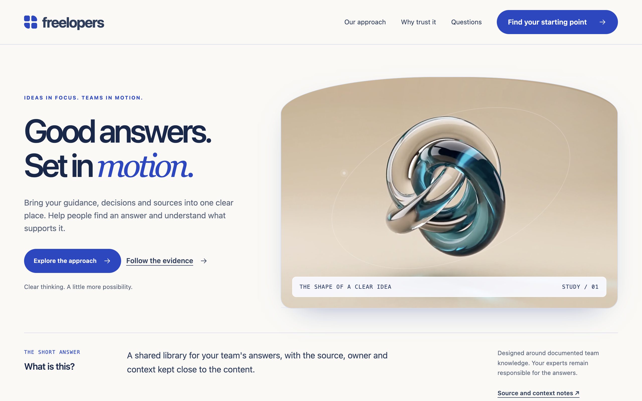
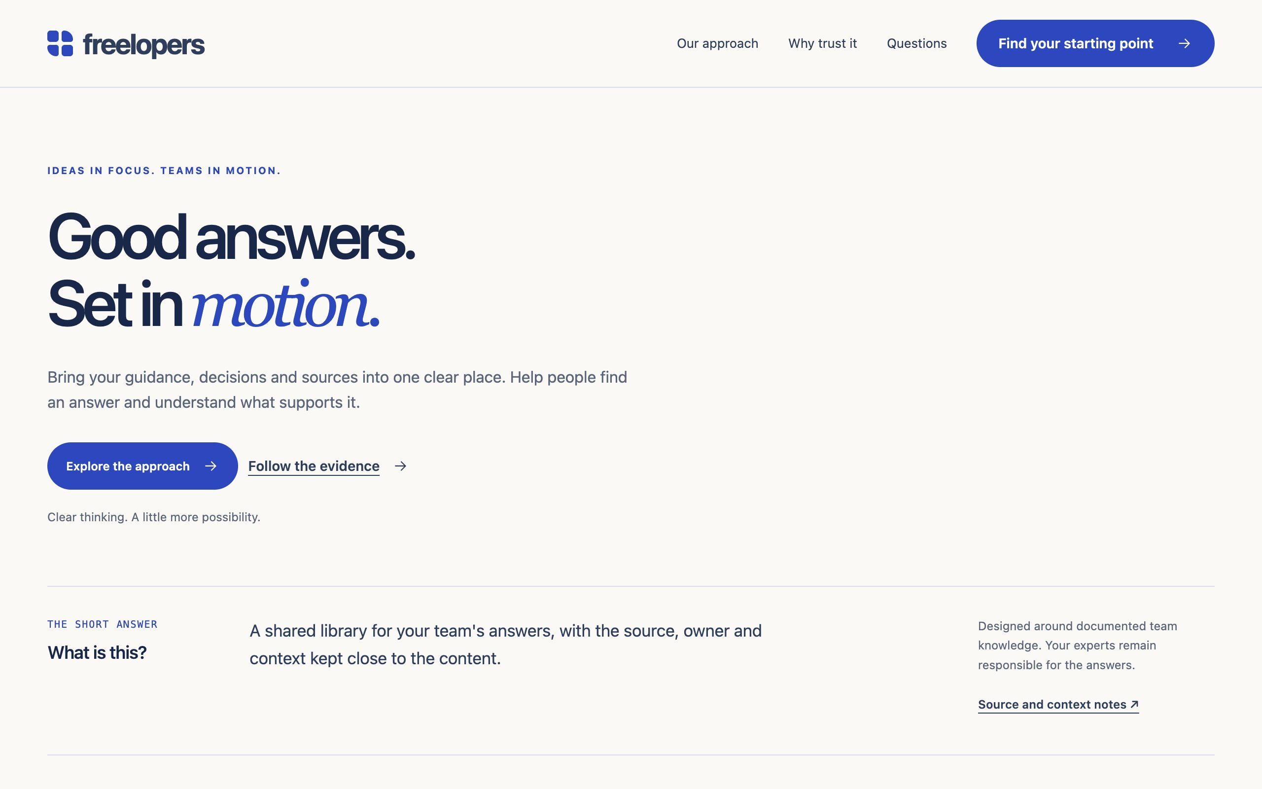
The hero. The page's only h1, a scene beside it, and the short answer under both.
| Field | What it does |
|---|---|
| Eyebrow, Title, Heading element | A line break in the title starts the second line; the Emphasis word in it is set in the accent italic. The element is h1 by default; change it only when the page has an h1 elsewhere. |
| Primary and secondary call to action | Text, link, style. Nothing renders until both a text and a destination are set. |
| Scene: Kind | A photograph, the abstract art with a clip, or no scene. With no scene the copy widens. |
| Scene: Motion level | Heavy, medium or light, for the whole page. See Motion. |
| Scene: Image, Motion clip | The theme ships its own photograph; an upload replaces it. The clip is a short silent mp4 from the File Manager, loaded only when the scene is on screen, motion is on and the connection is not saving data. |
| Answer: Question, Definition, Scope, Source | The question in a reader's words; the two sentences an answer engine quotes; what the answer does and does not cover; where the notes behind it live. |
| Answer engines | Publish structured data; show the schema badge. |
| Style | Heading, subheading and body sizes; surface; spacing. |
Publishes a Question with @id, mainEntityOfPage
and an acceptedAnswer whose url points back at the section. The layout's
speakable specification points at the h1 and this answer.
5.2 Evidence cards
One to eight claims in a grid, each with its source and, behind a disclosure, the reasoning.
| Field | What it does |
|---|---|
| Content | Eyebrow, title, description, heading element, a note under the grid, anchor. |
| Items: Symbol, Kicker, Title, Explanation | An icon (link, person, document, check, clock, none); the small line after the index; the claim in one sentence; what it means in practice. |
| Items: Source | Type (the small line above), link text, link. Published as the claim's citation. |
| Items: Detail | Shown behind Why this matters. Leave empty to hide the disclosure. |
| Items: Owner, Reviewed on | A credit line under the source, shown only when entered. Fill them on a real site; they are the part of an answer that makes it trustworthy. |
| Style: Columns | Auto, one, two or three. |
Publishes an ItemList of Claim. A claim needs only a title to
be published; citation, author and review date appear when entered.
5.3 Method explorer
Three steps as tabs beside a panel, each with what you start with and what you leave with. With scripts off all three panels are readable in order.
| Field | What it does |
|---|---|
| Content | Eyebrow, title, description, heading element, anchor. |
| Items: Tab, Title, Explanation | The word on the tab; the step's heading; what happens in it. |
| Items: Input, Output | Shown under Start with and Leave with. |
| Items: Source | Where the reasoning behind the step lives. The link text defaults to Explore the reasoning. |
Publishes a HowTo with three HowToSteps, each with its URL.
The art beside each step is drawn by the theme; at heavy motion it floats and tilts with the pointer.
5.4 Fit comparison
A real table with three fixed columns: the consideration, the reference option, the option this page argues for. It scrolls inside its own region on a phone. A comparison with more options is a different module, not a setting.
| Field | What it does |
|---|---|
| Content | Eyebrow, title, description, heading element; the three column labels; a caption read by screen readers; a note under the table; anchor. |
| Items: Criterion, Reference, Answer | One row each: the thing compared, how the reference handles it, how the highlighted option handles it. |
Publishes an ItemList of two Products carrying the rows as
additionalProperty pairs.
5.5 Expert answers
Questions with answers, each a native <details>: it opens without scripts and a
screen reader announces its state.
| Field | What it does |
|---|---|
| Content | Eyebrow, title, an editorial note, heading element, anchor. |
| Items: Question, Answer | Published as the FAQ question and its accepted answer. Keep answers self-contained: an answer that says "see above" is useless once quoted. |
| Items: Source, Owner, Reviewed on | The source under the answer; the credit line, only when entered. |
| Style: Disclosure motion | Follow the page, a level of its own, or off. |
Publishes an FAQPage with every question that has an answer.
5.6 Next step
The decision guide: two to four situations as buttons, one route each, in a dark shell.
| Field | What it does |
|---|---|
| Content | Eyebrow, title, description, heading element, the label of the button group, anchor. |
| Items: Tab, Title, Explanation, Question | The word on the button; the first thing this team should do; why; the question they keep hearing, shown as a quote. |
| Items: Call to action | Text, link, style. |
Publishes nothing, on purpose.
5.7 The fragments
Call to action link: one call to action (text, link, style) with the theme's arrow, available anywhere. Navigation: a HubSpot menu rendered as the theme's own markup, one level of children as disclosures, an optional call to action at the end. The menu comes from the module field first, then from theme settings.
6. The rules every module shares
- Anchor. Each module has an Anchor field, the section's id, so
#evidencein a link scrolls there. Two copies of a module on one page need two anchors. - Heading element and size are separate. Heading element is a content decision and keeps the outline honest; subheadings inside a module take the next level down on their own. Heading size, Subheading size and Body size are style decisions, so an
h2can wear theh3size. - A call to action is always the same three fields: text, link, style.
- A source is always the same three fields: type, link text, link. It is what the structured data publishes as the citation.
- Links that leave the page carry the ↗ mark; forward links carry the arrow.
- Surface and spacing. Every section can sit on the page colour, white, mist or navy (inverse, with every colour flipped for the text inside), and can be compact, comfortable or generous.
- Structured data is a switch, on by default. Turn it off on the second copy of a module so a page never carries two blocks of the same type.
- Nothing is invented. No rating, price, person or date appears in the data unless it was typed into a field.
7. Motion
Three levels, set once per page on the hero's Motion level, or with ?motion=light
on the address for a preview. The visitor can turn all of it off with the switch in the footer, and a
device that asks for reduced motion, or a connection that is saving data, always wins.
| Effect | Light | Medium | Heavy |
|---|---|---|---|
| Sections enter | quick fade | staggered reveal | staggered reveal |
| Headline arrives line by line; the accent word settles and catches the light | yes | yes | |
| Evidence cards: a band of light, the symbol glows once | yes | yes | |
| Comparison rows wipe in one after another | yes | yes | |
| Schema badges type themselves in | yes | yes | |
| The hero clip plays (abstract scene) | on request | yes | |
| Tokens drift behind the hero and flow upward on scroll | yes, fine pointer | ||
| Scene, caption and buttons answer the pointer | yes, fine pointer | ||
| Sparks from a section's eyebrow the first time it enters | yes | ||
| Method art floats and tilts with the pointer | yes, fine pointer | ||
| The schema object, a slow cube naming what the page publishes | yes, fine pointer, wide screens |
Every effect moves with transform and opacity only, pauses off screen, and adds nothing a machine reads. On a phone the pointer-driven parts do not exist.
8. Structured data
| Block | From | What Google does with it today |
|---|---|---|
Organization, WebSite, WebPage, BreadcrumbList | the layout, one graph on every page | breadcrumb eligible; the organisation feeds the knowledge panel |
Question with acceptedAnswer | Answer brief | no single question feature; entity data for answer engines |
ItemList of Claim | Evidence cards | Claim is a pending schema.org type; entity data |
HowTo | Method explorer | HowTo rich results retired in 2023; the steps still read as ordered steps |
ItemList of Product | Fit comparison | a rich result needs offers or reviews, which are not invented here |
FAQPage | Expert answers | rich result limited to government and health sites since 2023; Bing and the answer engines still read it |
That last column is the honest one. The point of the markup is not a rich snippet; it is that an answer engine reading the page gets the question, the answer, who stands behind it and where it came from as typed data, which is what makes a page quotable and attributable. Every URL in the data is absolute, and every block is compared with the visible text before a release.
9. Building a page
Seven page templates (home, page, about, contact, landing page, blog listing, blog post) and seven system templates. Five sections in the section library compose the modules into ready rows: answer and evidence, method and fit, questions and next step, text and image, a statement.
The recipe for a page that reads well to a machine: one hero with the question and its answer; evidence with real sources, owners and review dates; one FAQ with self-contained answers; a next step. Then check it as a crawler would, with scripts off, and confirm the answer is near the top and every claim points somewhere.
10. Questions
Can I use it without the structured data?
Yes. Every module has a Publish structured data switch. The page reads the same; it just stops telling machines what it is.
Where does the hero clip come from?
A theme cannot contain a video, so the clip is a file you upload to the File Manager and choose on the hero's Motion clip field. The hero is complete without one.
Why is the address missing from the data?
Because one of street, city or country is empty in Settings, Account Defaults. The graph publishes the address whole or not at all.
Does the menu come from my HubSpot navigation?
Yes. Put the menu's id in the theme settings (Header, Footer), or choose a menu on the navigation module of a single page to override it there.
What happens with JavaScript off?
Everything is readable: every tab panel and route is shown in order, every disclosure opens natively, and the page's data is unchanged, because it is in the HTML, not built by a script.