

Theme DeLight 2023
Still improving our theme for you!

Single Card Module provides a mini card for especially drag and drop areas. Background image or only color can be set. It has a special hover effect.

Single Card Module provides a mini card for especially drag and drop areas. Background image or only color can be set. It has a special hover effect.

Single Card Module provides a mini card for especially drag and drop areas. Background image or only color can be set. It has a special hover effect.
What is the purpose of the Two-Column List View Module? In the beginning, this module provides two columns grid, having a logo on the top, content on the middle, CTA or Link on the bottom. The grid view can be adjusted as left or center. Also, if desired, cards can be duplicated by following Two-Column List View Module > Cards > +Add. Moreover, by clicking into the Module Controller, you can edit the font color and the background of the cards & module, changing the background image of each card, you might remove or add the borders, lines, and even arranging the spaces.
We are a team of four and we consider Theme DeLight as our special project. We are happy to help you beautify and optimize your website. If you need any custom and unique touches on your HubSpot website, we are also happy to help you. We are a team of four and we consider Theme DeLight as our special project. We are happy to help you beautify and optimize your website. If you need any custom and unique touches on your HubSpot website, we are also happy to help you.
We are a team of four and we consider Theme DeLight as our special project. We are happy to help you beautify and optimize your website. If you need any custom and unique touches on your HubSpot website, we are also happy to help you. We are a team of four and we consider Theme DeLight as our special project. We are happy to help you beautify and optimize your website. If you need any custom and unique touches on your HubSpot website, we are also happy to help you.
What is the purpose of the Two-Column Image-Text Module? This module provides two columns view, having content on the left, the image on the right, CTA, or Link on the bottom. If desired, columns can be reversed.
What is the purpose of the Two-Column Image-Text Module? This module provides two columns view, having content on the left, the image on the right, CTA, or Link on the bottom. If desired, columns can be reversed.
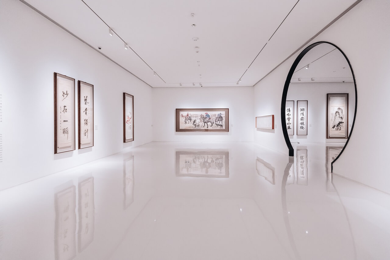
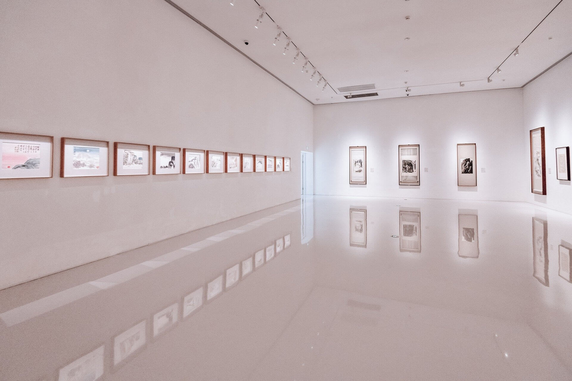
Gallery View Module consists of full images. Provides 3 different structures having the main part ( top wide image ), two-column part ( bottom ), and side ( right ) part. Also if any text is written on an image, the overlay is automatically enabled and overlay color can be changed. If desired, CTA or extra images can be added. The new "zoom-in" feature enables a bigger view with a pop-up.

