Extended Button
Extended Button Module
The Extended Button module is a versatile tool designed to enhance website navigation and user engagement. It goes beyond the functionality of a standard button by offering advanced features such as:
Smooth Scrolling: With a simple click, the Extended Button allows users to glide through the page to a specified section, providing a seamless and interactive experience.
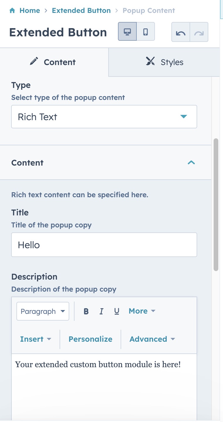
Popup Activation: The button can trigger customizable popups, which can be configured to display a variety of content types to suit your needs. Whether it's for lead generation forms or for delivering rich text content, the popup ensures your message is delivered effectively.
Content Flexibility: You have the freedom to adjust the popup content, choosing between text information and forms. This flexibility ensures that the module serves a wide range of purposes, from capturing user information to providing important announcements or offers.
In essence, the Extended Button module is a powerful asset for any website, providing a professional look with a rich set of interactive features that can be tailored to match any marketing strategy or user interaction design.
After the installation of our module, just open one of the pages where you want to use the module in, and then search for it from the search box in the side bar as shown in the screenshot;
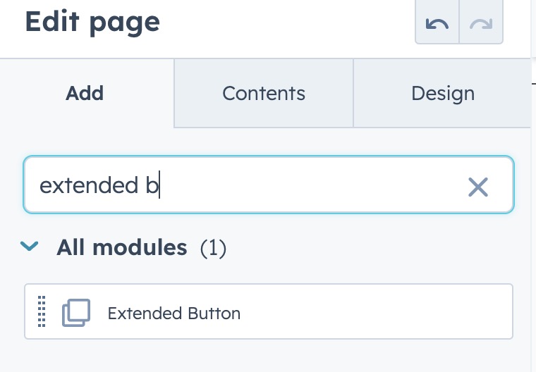
and then drag & drop it into the desired part of the page.
✅ Pick the button type ( either CTA or Link Button )
Link button brings all the features such as the anchor by smooth scrolling or triggering a popup
✅ Enter the label of the button and specify its behavior
You can make it lead the users to an external page or open a HubSpot page.
✅ Run anchor behavior
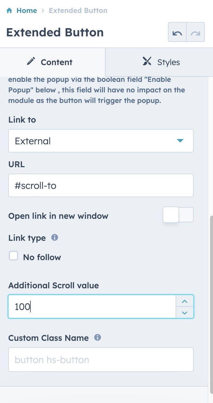
- Pick the "External" option
- Specify the URL as shown ( "scroll-to" is the anchor defined in one of the texts in the page. Please see here to understand how to define an anchor )
- The scroll behavior is defined by taking the header element into consideration so that the content does not overlap with the navigation if you have a sticky navigation. If the scroll does not end in the desired location, you can adjust it by the additional scroll value ( it can be a negative value as well )
- The custom class name is used for allowing you to use a specific class name from the theme that you are already using. That way you can inherit a specific rule or apply different set of style rules.
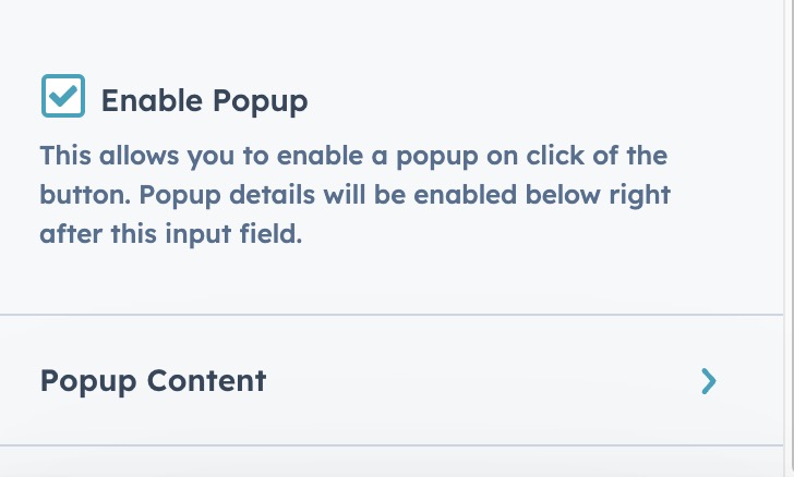
✅ Enable popup
- Define a popup behavior instead of a regular link click
- This way you can let users to see some content without leaving the current page
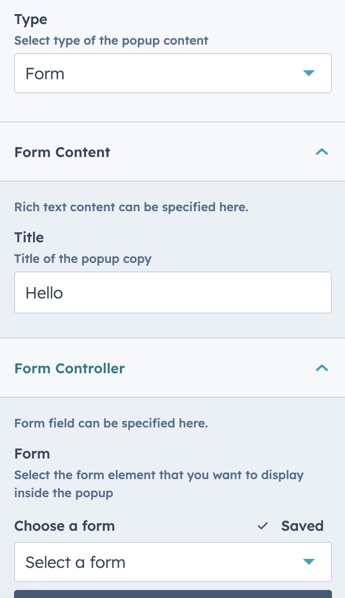
✅ Popup with a Form
- Select this feature when you aim to present a popup form.
- Then specify what form you would like to display.
b. Styles Tab | Details
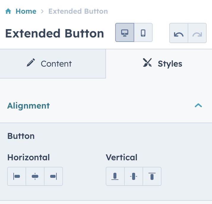
✅ You may adjust the alignment of the button
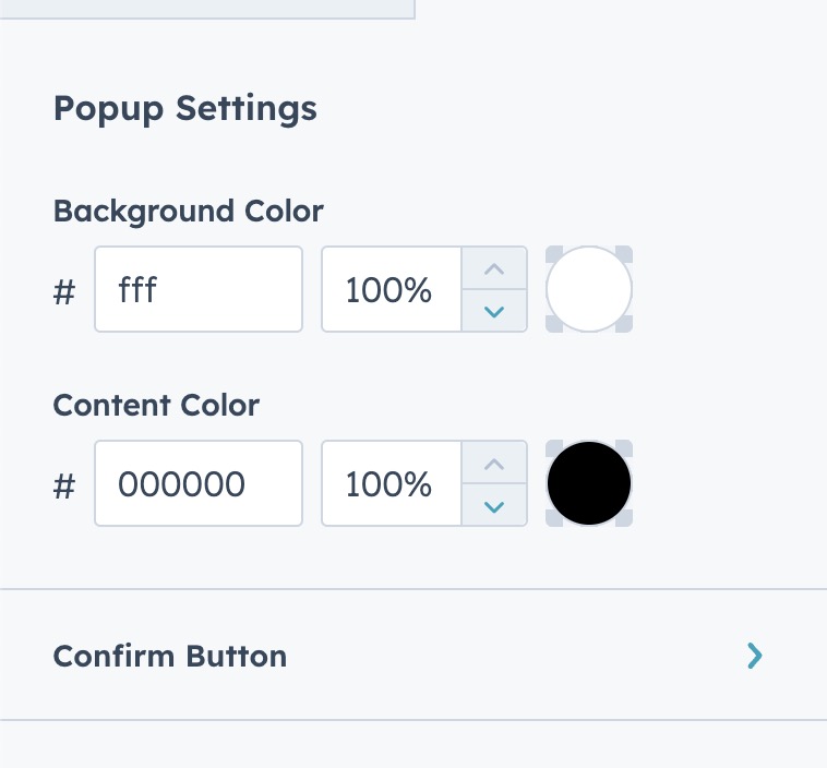
✅ You also have a chance to control the color settings of the popup along with the Confirm Button being displayed as a part of popup.
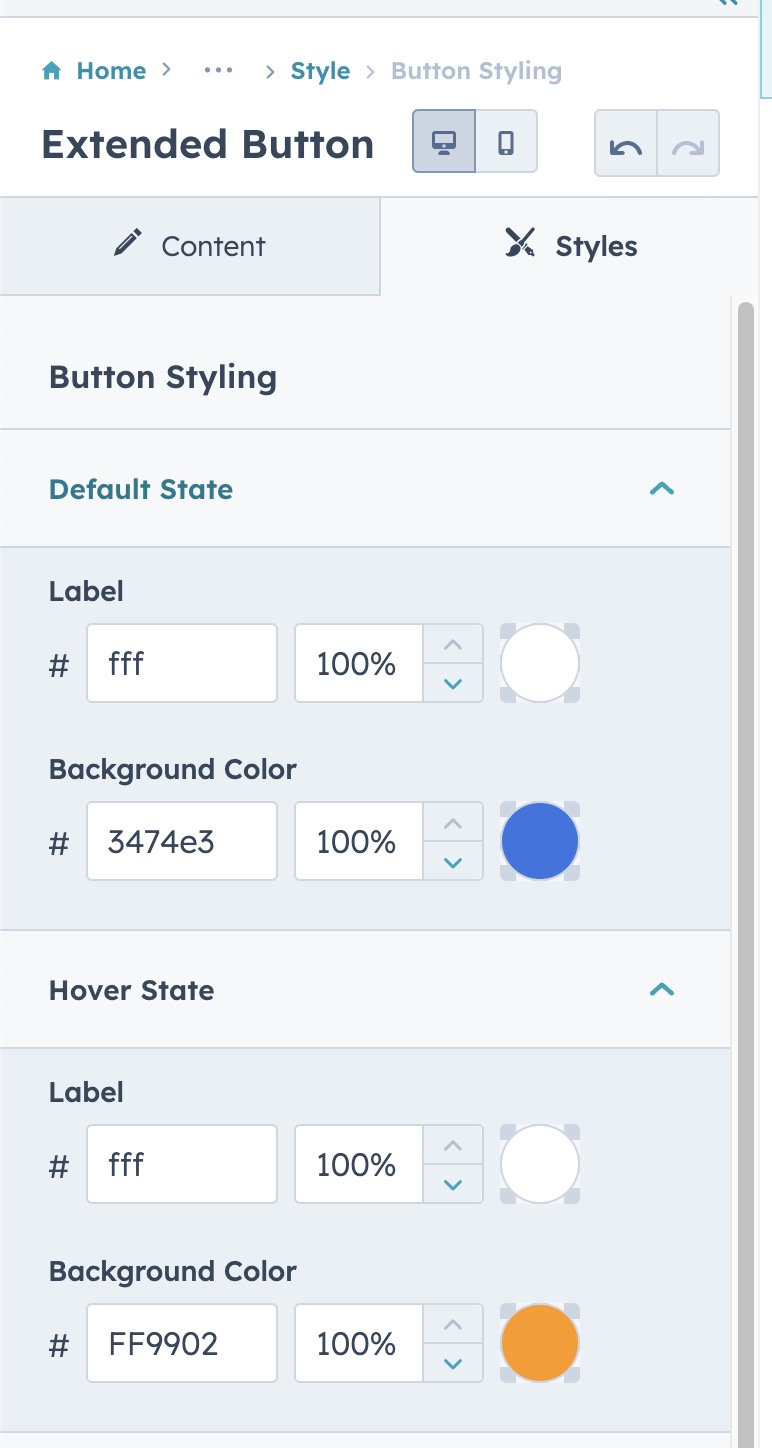
✅ You can define the label color and background color of both default and hover states of the button.
