


Two-Column List View
What is the purpose of the Two-Column List View Module? In the beginning, this module provides two columns grid, having a logo on the top, content on the middle, CTA or Link on the bottom. The grid view can be adjusted as left or center. Also, if desired, cards can be duplicated by following Two-Column List View Module > Cards > +Add. Moreover, by clicking into the Module Controller, you can edit the font color and the background of the cards & module, changing the background image of each card, you might remove or add the borders, lines, and even arranging the spaces.

EXPLORE 1
We are a team of four and we consider Theme DeLight as our special project. We are happy to help you beautify and optimize your website. If you need any custom and unique touches on your HubSpot website, we are also happy to help you. We are a team of four and we consider Theme DeLight as our special project. We are happy to help you beautify and optimize your website. If you need any custom and unique touches on your HubSpot website, we are also happy to help you.

EXPLORE 2
We are a team of four and we consider Theme DeLight as our special project. We are happy to help you beautify and optimize your website. If you need any custom and unique touches on your HubSpot website, we are also happy to help you. We are a team of four and we consider Theme DeLight as our special project. We are happy to help you beautify and optimize your website. If you need any custom and unique touches on your HubSpot website, we are also happy to help you.
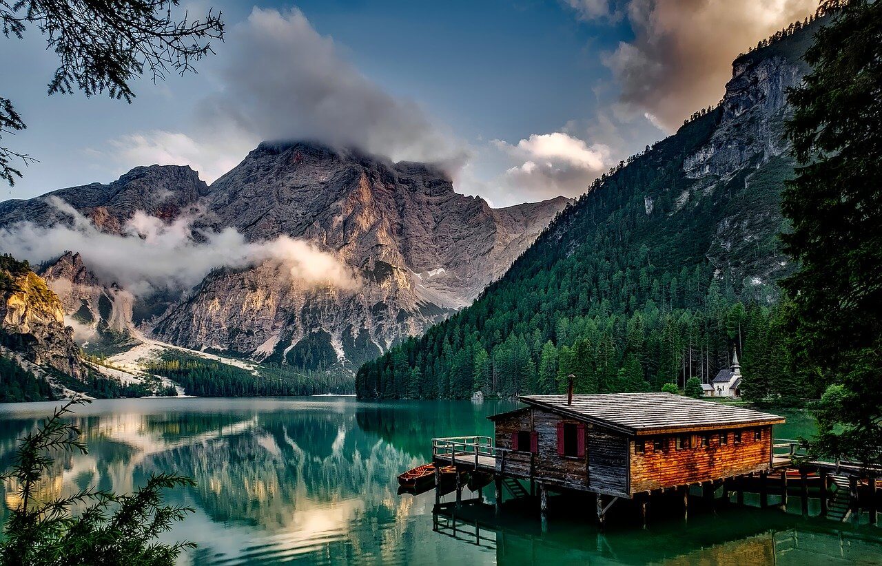
Two-Column Image And Text Module
What is the purpose of the Two-Column Image-Text Module? This module provides two columns view, having content on the left, the image on the right, CTA, or Link on the bottom. If desired, columns can be reversed.

Two-Column Image And Text Module
What is the purpose of the Two-Column Image-Text Module? This module provides two columns view, having content on the left, the image on the right, CTA, or Link on the bottom. If desired, columns can be reversed.